No app
Website todayAccording to the FAQ there is no mobile app, only the website.
In the appA native app for Android and iOS from one C# codebase.
Unofficial hobby project
.NET MAUI | C# | designed in XAML | Clean Architecture, Domain Driven Design (DDD) | Agentic Development
A proof-of-concept for how a mobile application of the original Global Penfriends website could be realized.
01Why
I enjoy using the platform. Three things bothered me – the app solves each of them.
Website todayAccording to the FAQ there is no mobile app, only the website.
In the appA native app for Android and iOS from one C# codebase.
Website todayNew messages arrive as an email – without sender or content.
In the appA push notification with the sender; one tap opens the chat.
Website todayNew messages often appear only after a reload.
In the appInbox and badges update instantly.
02Tour
Play the video or pick a chapter – the explanation and the original website for comparison appear with it.
We can see the layout for a log-in page following the Email and Password authentication from Global Penfriends. For anyone interested in testing, a download button for the .apk is available at the bottom. To access the next pages, you can either go through the registration process or just use the hardcoded / pre-existing credentials: admin@globalpenfriends.com / Password123!
Original website for comparison
We can see page 1/4 of the registration process. We can also see working validation after inputting a bad whitespace character into the profile name. The rules for validation are the same that the original Website uses. Below is a reference from the original website's page 1.
Original website for comparison
We can see page 2/4 of the registration process. Here some more personal data is required as well as the acknowledgement checkbox, that the website is not used for dating. Global Penfriends has a very strict policy to ensure everyone is safe around there. I personally recommend giving the community a try, I have had a couple of very pleasant encounters and experienced my very first Penpalship with actual letter exchange.
Original website for comparison
We can see page 3/4 of the registration process. This is a shorter section as all we do here is select a set of interests we want to display on our profile. The choices are predefined by the Website and I included every selectable interest as of the last state of February 12, 2026. To add onto that feature, I also grouped the interests a little bit, since I thought the way it was implemented was quite chaotic.
Original website for comparison
We can see page 4/4 of the registration process. This is one that looks pretty short but requires quite a bit of effort. To finish creating your profile, the community requires to explain a bit about yourself, what you look for in a penpal and to share some culture of where you live. There is a minimum and maximum amount of characters for a limit.
Original website for comparison
This is a very short page, but just gives the same information you would get when finishing the registration on the website. Your profile is being prepared for review by a real human and activation. In the meantime you can still change your pictures or edit your profile.
Original website for comparison
Finally we can see our dashboard. It is heavily inspired by the dashboard of the original website. The goal was to keep the look and feel the same, have the standard boxes there with their functionality. First we have a box for welcoming the user, show their current subscription tier, their ID, snailmail credits as well as their current picture. The website allows for 3 pictures total, and by clicking the camera icon we can select a picture from our local storage. Next we have a box that shows all the steps that are done or awaiting to be done on the left as well as the approval status. On the right we have a yellow notification box. Any updates or System messages by the admins can be displayed there. And below it is a small reminder to support them by upgrading functionalities with their monetization System.
Original website for comparison
After a click on the camera, we see the option to select a picture for our profile with the local installed apps – in this case it was Google Photos. We can see the selected stock photo of a person appear both in the ring where the camera once was, which also now is our main active picture and always shows first. A little bit further down, we can now finally see 1/3 pictures in the little box. There is a bin icon we can click to remove a picture from our profile. It will automatically replace the active profile picture to the next one on the line, if there is one. Below this box is a button to open the "My Profile" view.
The profile view is also heavily inspired by the profile view of the original Website. At the top we have to possibility to click on a picture in order to see a full screen view of the picture, given the format fits. This profile view basically is a combination of all pages 1–4 of the registration page, but formatted in a well readable format with sections. The interests can also be opened to view more of them, and will light up green when viewing another persons profile and the interests match. All the way at the bottom we have the feature for Similar Profiles, which presents us a couple of profiles to contact and meet new penpals.
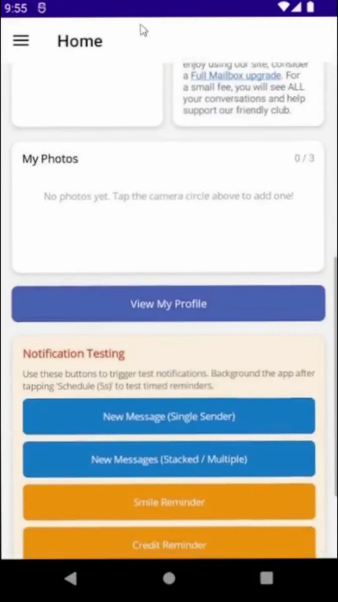
This part is less relevant for the normal user of the app and would be removed in an actual release. That's why it is called "Notification Test" and its purpose is to trigger different types of system notifications to test them out. One of them would be the notification of receiving a new message from a user on the website. This actually was one of the key motivators for me to create a mobile application proof of concept for their website. In the FAQ they noted, that there currently is no mobile application and the only way to get notified of a new message was to check your Emails. And even there, you would not learn any information on who messaged you or the contents of the message. It felt like a primitive and outdated way of dealing with what we can do nowadays with instant messaging notifications for instance. And the website itself has a weird snapshot based system, where when you are in your inbox, you don't necessarily notice you got a new message until you refresh the website or go to the dashboard first.
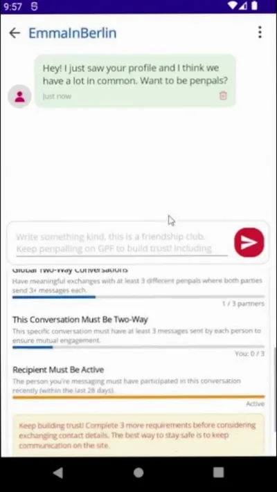
After triggering the message notification and tapping on it, we land directly on the messaging page with that profile. It is one of the core aspects of the Website, your first form of contacting people. The website requires quite a few steps for you to establish "Trust" and be able to share your contact details with the new penpal to maybe switch to letter exchanges. Messages can be sent like normal instant message software. The 3-dot menu at the top right allows to visit the profile, block the user or report them to the staff of the website. The profile can also be visited through clicking on the buddy icon / profile picture. Depending on the selected gender, the buddy icon also changes its color.
Original website for comparison
Here we can see how another person's profile page looks like. Since this person did not have pictures uploaded, we did not see the box with the pictures to click on them and view them bigger. We can send another profile a smile to notify them that we viewed their profile, considered them interesting and want to contact them. Due to the website's limited daily free contact credit, smiles are usually a good first way of contact. We can also directly contact them, landing back in the corresponding instant messaging view. At the bottom we have a locked area with additional information, saved for premium users. A tap on the linked message or the box will bring us to the monetization page.
Original website for comparison
This is the entire monetization page, which is basically a 1-to-1 replica of what the original website offers.
Original website for comparison
When we go back from a direct message with a person, we reach the inbox view. Here we have our last contacted profiles, notification bubbles of unread messages and so on. Everything here is following the standard design of the original Website, just translated to my interpretation of how it would look like in a modern smartphone application.
Original website for comparison
The burger menu on the top left is another way of easing the navigation through the app. And then we get to another core feature of the original website, the penpal search. I won't go into too much detail, but it is basically just a 1-to-1 implementation of the original Website's search function.
Original website for comparison
The rest of the notification tests, such as multiple messages which direct to the inbox page, daily smile and credit reminder and one test of a time-based notification for when the app is not active like Facebook and other social media use.
03Screens
Stills from the demo video – the real app on an Android device, with test data.
04Tech
Built like a production app: clear layers, testable, with a swappable data source.
GlobalPenFriendsthe app (UI, view models)GlobalPenFriends.Corebusiness logic, domainGlobalPenFriends.UnitTestsxUnit, Moq, FluentAssertionsGlobalPenFriends.Testsintegration testsProof of concept with mock data services. Phase 2 on the roadmap: a real API. Passwords hashed with BCrypt, tokens in Keychain/Keystore.
05Download
The app runs entirely locally with test data – no real accounts or messages are involved.
iOS: the app is cross-platform, but there is no public iOS build.
Demo login